HTML Layout Techniques
Creating HTML layouts are the most important things while designing a website, as it will ensure that your website looks in a well-arranged way and the content appears easy to understand. There are different techniques, and frameworks available for creating HTML layouts.
Create multicolumn layouts:
- HTML tables
- CSS float property
- CSS framework
- CSS flexbox
- Layout using div
HTML Tables :
HTML table-based layout is one of the easiest ways for creating an HTML layout, as table use only rows and column-based format, but HTML tables are not recommended for your page layout.
Example:
<!DOCTYPE html>
<html>
<head>
<style>
li{
display: inline-block;
padding: 10px;}
a{
color:#20b2aa;
}
</style>
</head>
<body>
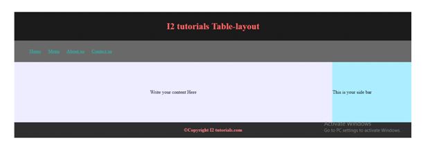
<!-- Header Section -->
<table width="100%" style="border-collapse:collapse;">
<tr>
<td colspan="2" style="background-color:#1a1a1a; text-align: center;">
<h3 style="font-size: 30px; color: #ff6a6a;">I2 tutorials Table-layout</h3>
</td>
</tr>
<!-- Nav Section -->
<tr>
<td colspan="2" style="background-color:#666666;">
<ul>
<li><a href="#">Home</a></li>
<li><a href="#">Menu</a></li>
<li><a href="#">About-us</a></li>
<li><a href="#">Contact us</a></li>
</ul>
</td>
</tr>
<!-- Main Section -->
<tr>
<td style="background-color:#e6e6fa; width:80%; height: 200px; text-align: center;">
<p>Write your content Here</p>
</td>
<td style="background-color:#a7e6fb; height: 200px;">
<p>This is your side bar</p>
</td>
</tr>
<!-- Footer Section -->
<tr>
<td colspan="2" style="background-color:#2e2e2e; text-align: center;">
<p style="color:#f08080">©<strong>Copyright I2 tutorials.com</strong></p>
</td>
</tr>
</table>
</body>
</html>
OUTPUT:
CSS Frameworks:
CSS provides many frameworks like CSS, Bootstrap, and many more, to create your layout fast. Using CSS frameworks you can easily provide a responsive and attractive web layout. Need to add a link for these frameworks (CSS, Bootstrap), and you can use all properties available in the framework.
CSS Float:
The entire web layout using the CSS float property.
Advantage: It just learns how the float and clear properties work.
Disadvantage: Floating elements are tied to the document flow,
Example:
<!DOCTYPE html>
<html>
<head>
<style>
div.container {
  width: 100%;
  border: 1px solid gray;
}

header, footer {
  padding: 1em;
  color: white;
  background-color: #000080;
  clear: left;
  text-align: center;
}

nav {
  float: left;
  max-width: 160px;
  margin: 0;
  padding: 1em;
}

nav ul {
  list-style-type: none;
  padding: 0;
}

nav ul a {
  text-decoration: none;
}

article {
  margin-left: 170px;
  border-left: 1px solid gray;
  padding: 1em;
  overflow: hidden;
}
</style>
</head>
<body>

<div class="container">
<header>
<h1>Tutorials Gallery</h1>
</header>

<nav>
<ul>
<li><a href="#">HTML</a></li>
<li><a href="#">CSS</a></li>
<li><a href="#">JavaScript</a></li>
</ul>

</nav>
<article>
<h1>HTML</h1>
<p>enter content here,,,,,,,,,,,,,,,,,.................</p>
<p>enter content here,,,,,,,,,,,,,,,,....................</p>
</article>
<footer>Copyright © i2tutorials.com</footer>
</div>
</body>
</html>
OUTPUT:
CSS Flexbox:
Flexbox is a new layout mode in CSS3.
Advantage: It ensures that the HTML page layout must accommodate various screen sizes and different display devices.
Disadvantages: It does not work in IE10 and earlier versions.
Example:
<!DOCTYPE html>
<html>
<head>
<style>
.flex-container {
display: -webkit-flex;
display: flex;
-webkit-flex-flow: row wrap;
flex-flow: row wrap;
text-align: center;
}
.flex-container > * {
padding: 15px;
-webkit-flex: 1 100%;
flex: 1 100%;
}
.article {
text-align: left;
}
header {background: #000080;color:white;}
footer {background: #000080;color:white;}
.nav {background:#eee;}
.nav ul {
list-style-type: none;
padding: 0;
}
.nav ul a {
text-decoration: none;
}
@media all and (min-width: 768px) {
.nav {text-align:left;-webkit-flex: 1 auto;flex:1 auto;-webkit-order:1;order:1;}
.article {-webkit-flex:5 0px;flex:5 0px;-webkit-order:2;order:2;}
footer {-webkit-order:3;order:3;}
}
</style>
</head>
<body>
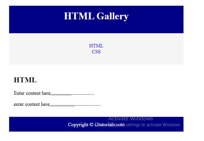
<div class="flex-container">
<header>
<h1>HTML Gallery</h1>
</header>
<nav class="nav">
<ul>
<li><a href="#">HTML</a></li>
<li><a href="#">CSS</a></li>
</ul>
</nav>
<article class="article">
<h1>HTML</h1>
<p>Enter content here,,,,,,,,,,,,,,,,,..................</p>
<p>enter content here,,,,,,,,,,,,,,,,,,,,.....................</p>
</article>
<footer>Copyright © i2tutorials.com</footer>
</div>
</body>
</html>
OUTPUT:
Layout using div:
Example:
<!DOCTYPE html>
<html>
<head>
<title>Webpage using div</title>
<style>
body{
margin:0px;
}
.header{
padding: 10px;
background-color:#455e64;
text-align: center;
}
.header h2{
color: black; }
/*===============[Nav CSS]==========*/
.nav{
background-color:#243238;
padding: 5px;
}
.nav li{
list-style: none;
display: inline-block;
padding: 8px;
}
.nav a{
color: #fff;
}
.nav ul li a:hover{
text-decoration: none;
color: #7fffd4;
}
.lside{
float: left;
width: 80%;
min-height: 200px;
background-color: #f0f8ff;
text-align: center;
}
.rside
{
text-align: center;
float: right;
width: 20%;
min-height: 200px;
background-color: #c1cdcd;
}
.footer{
height: 44px;
background-color:#455e64;
text-align: center;
padding-top: 10px;}
.footer p{
color: #8fbc8f;
}
</style>
</head>
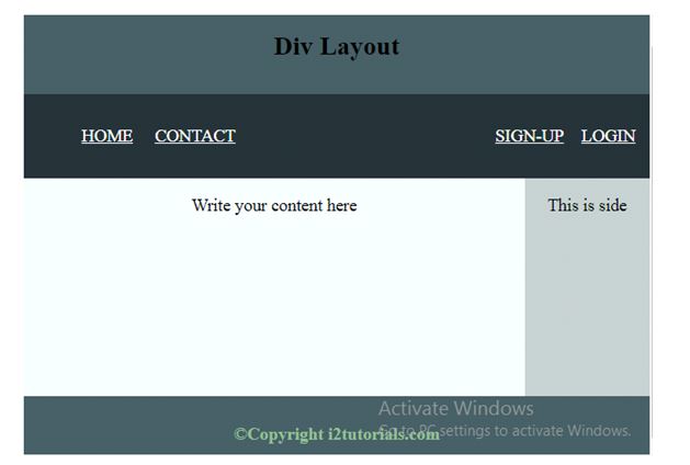
<body>
<div>
<div class="header">
<h2>Div Layout</h2>
</div>
<!-- Nav -->
<div class="nav">
<ul>
<li><a href="#">HOME</a></li>
<li><a href="#">CONTACT</a></li>
<li style="float: right;"><a href="#">LOGIN</a></li>
<li style="float: right;"><a href="#">SIGN-UP</a></li>
</ul>
</div>
<!-- main -->
<div style="height:200px">
<div class="lside">
<p>Write your content here</p>
</div>
<!-- side -->
<div class="rside">
<p>This is side</p>
</div>
</div>
<!-- footer -->
<div class="footer">
<p>©<strong>Copyright i2tutorials.com</strong></p>
</div>
</div>
</body>
</html>
OUTPUT: