HTML Responsive
Responsive Web design: Responsive web design( Responsive) is used to make your web page look appropriate, good, and well placed on all devices (desktop, tablet, smartphone, etc.)
Responsive web design uses HTML(Hypertext Markup Language) and CSS(Cascading Style Sheets) to resize, hide, shrink, or enlarge, to make it look good on all devices. It makes the content look good to view on any screen.
Responsive Images:
Images that can be scaled nicely to fit any browser size are known as responsive images.
The CSS images width property to 100% to make the image responsive and scale up and down.
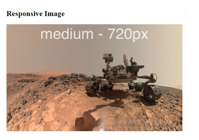
Example:
<!DOCTYPE html>
<html>
<meta name="viewport" content="width=device-width, initial-scale=1.0">
<body>
<h2>Responsive Image</h2>
<img src="https://www.bennet.org/blog/responsive-images-busy-people/images/curiosity-medium.jpg" style="width:100%;">
</body>
</html>
OUTPUT:
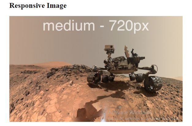
using the max-width Property:
The max-width property is best and most used because it facilitates that the image will scale down if it has to, but never scale up to be larger than its original size.
Example:
<!DOCTYPE html>
<html>
<meta name="viewport" content="width=device-width, initial-scale=1.0">
<body>
<h2>Responsive Image</h2>
<img src="https://www.bennet.org/blog/responsive-images-busy-people/images/curiosity-medium.jpg" style="max-width:100%;height:auto;">
</body>
</html>
OUTPUT:
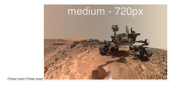
Change images according to the browser width:
By using the HTML <picture> element, we can set two or more images according to the browser width. It will change the picture when you change the various browser-size. i.e. desktop and phone, large desktop.
Example:
<!DOCTYPE html>
<html>
<meta name="viewport" content="width=device-width, initial-scale=1.0">
<body>
<picture>
<source srcset="https://www.bennet.org/blog/responsive-images-busy-people/images/curiosity-medium.jpg" media="(max-width: 600px)">(Change image)
<source srcset="https://www.bennet.org/blog/responsive-images-busy-people/images/curiosity-medium.jpg" media="(max-width: 1500px)">(Change image)
<source srcset="https://www.bennet.org/blog/responsive-images-busy-people/images/curiosity-medium.jpg">
<img src="https://www.bennet.org/blog/responsive-images-busy-people/images/curiosity-medium.jpg" alt="Flowers" style="width:auto;">
</picture>
</body>
</html>
OUTPUT:
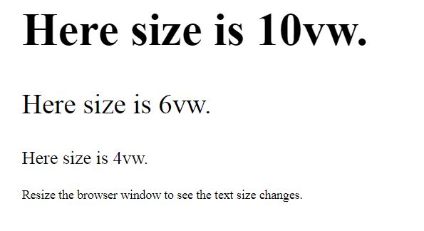
Responsive Text-size:
We can make the text size web responsive by using the “UV” unit. It means viewport-width. By using this, we can make the text size to follow the various browser window screen.
Example:
<!DOCTYPE html>
<html>
<meta name="viewport" content="width=device-width, initial-scale=1.0">
<body>
<h1 style="font-size:10vw;">Here size is 10vw.</h1>
<p style="font-size:6vw;">Here size is 6vw.</p>
<p style="font-size:4vw;">Here size is 4vw.</p>
<p>Resize the browser window to see the text size changes.</p>
</body>
</html>
OUTPUT:
Media Query:
Use media queries to make responsive websites.
LIST:
/*
 ##Device = Desktops
 ##Screen = 1281px to higher resolution desktops
*/

@media (min-width: 1281px) {

 /* CSS */

}

/*
 ##Device = Laptops, Desktops
 ##Screen = B/w 1025px to 1280px
*/

@media (min-width: 1025px) and (max-width: 1280px) {
 /* CSS */
}

/*
 ##Device = Tablets, Ipads (portrait)
 ##Screen = B/w 768px to 1024px
*/

@media (min-width: 768px) and (max-width: 1024px) {
 /* CSS */
}

/*
 ##Device = Tablets, Ipads (landscape)
 ##Screen = B/w 768px to 1024px
*/

@media (min-width: 768px) and (max-width: 1024px) and (orientation: landscape) {
 /* CSS */
}

/*
 ##Device = Low Resolution Tablets, Mobiles (Landscape)
 ##Screen = B/w 481px to 767px
*/

@media (min-width: 481px) and (max-width: 767px) {
 /* CSS */
}

/*
 ##Device = Most of the Smartphones Mobiles (Portrait)
 ##Screen = B/w 320px to 479px
*/

@media (min-width: 320px) and (max-width: 480px) {
 /* CSS */
}