Area Chart – Tableau
What is Tableau Area Chart?
In Tableau, area charts provide a visual representation of the relationships between different aspects or dimensions within a dataset. As a result, this relationship is displayed as a proportion of totals or as a percentage of certain data values. A comparison between different dimensions and values can be made by analyzing the area under each line and how it changes over time.
In Tableau, there are two types of area charts: Continuous Area Charts and Discrete Area Charts. As continuous area charts do not have individual values, they are always measured. The discrete area chart, on the other hand, takes individual values of a category and therefore always counts them.
Please ensure that your data source meets the following basic requirements before we begin creating the area chart.
- Mark type – Area
- Columns shelf – Dimension
- Rows shelf – Measure
- Color – Dimension
- Detail – Dimension (optional)
How is Tableau Area Chart created ?
In this article, we will discuss how to create an area chart in Tableau Desktop. You can create a Tableau area chart by opening Tableau Desktop and following the steps below. Ensure that your preferred data source has already been connected.
Step 1: Open Tableau’s Visualization Pane
Create a new sheet in your Tableau workbook. On the left side of the screen, you will find a list of the dimensions and measures from the connected data source. We have a visualization pane on the right side of the screen. The Show Me option allows you to hide or show this pane. You will find two options for area charts in this pane, which are Area charts (Continuous) and Area charts (Discrete).
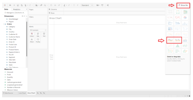
Step 2: In the Visualization Pane, select the Area Chart
In order to make an area chart, Tableau recommends using a date field. To begin, we will drag a date dimension into the Columns section. In the visualization pane, select Area charts (Continuous) if it is not already selected.
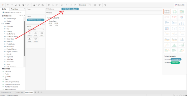
Step 3: Adding a measure
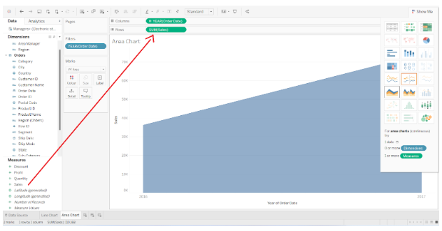
In the next step, we will drag and drop one measure (Sales) into the Rows section.
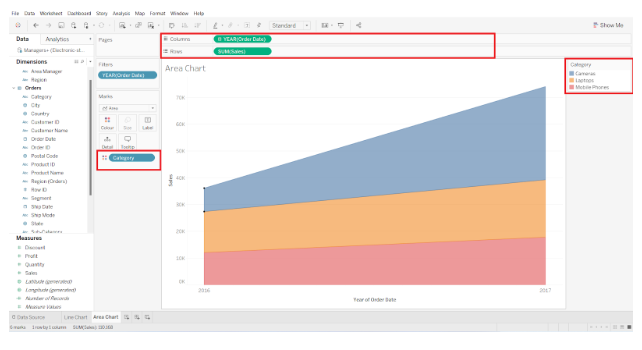
Step 4: Adding dimensions to the colors box
We will now add another dimension (Category) to the Colors box of the Marks pane. Colors will be added to the chart according to category, and each category will be represented by a different color.

Step 5: A basic guide to creating area charts
In this example, the chart is divided into three color zones corresponding to the three categories of Cameras, Laptops, and Mobile Phones. X-axis or column axis shows four years, 2016 to 2019. The y-axis or row axis represents the scale for total sales.
Over a period of four years, this area chart illustrates the sales of three categories of products, indicated by blue (Cameras), yellow (Laptops), and red (Mobile Phones).
Step 6: Making the Basic Area Chart more detailed
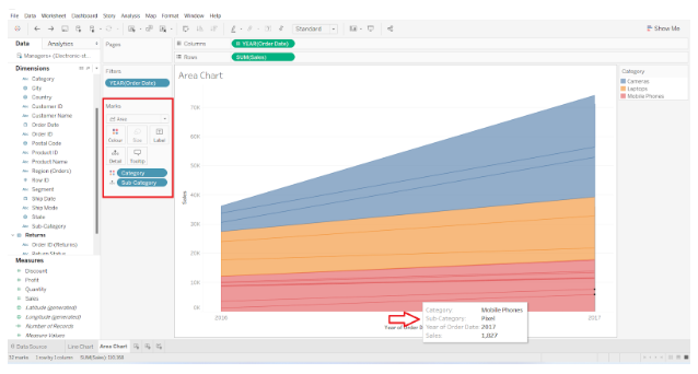
This simple area chart in Tableau can also be made more detailed by adding another dimension (Sub-category) to the Details box in the Marks pane. In the category of Mobile Phones, thin lines will be added to represent subcategories such as OnePlus, iPhone, Samsung, etc. To read the details pertaining to each area segment, hover your cursor over it.
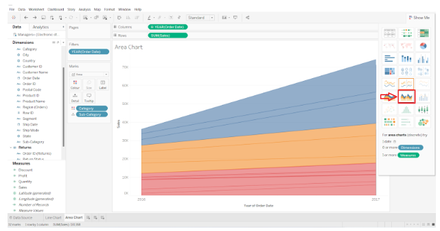
Step 7:The Discrete Area Chart can be viewed here
Now let us examine how the discrete area chart differs from the other type of area chart. In order to accomplish this, we need to return to the visualization pane and select the Area charts (discrete) option.
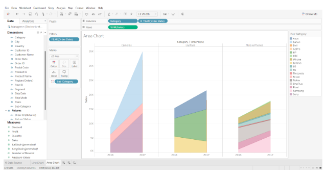
Step 8: The conversion of a continuous area chart into a discrete area chart
The continuous type area chart will be instantly transformed into a discrete type area chart. According to the screenshot attached below, the discrete area chart divides the chart space into three sections and displays separate charts for each category.
This the process of creating a Tableau area chart.