
Tableau – Bar Chart
What is Bar Chart?
A bar chart or graph represents category-wise data from a dataset. The length of the bars is proportional to the value represented by each category. This provides an instant visual representation of the data. We can create several different types of bar graphs in Tableau, including simple vertical bar graphs (also known as line graphs), segmented bar graphs, stacked bar graphs, and side-by-side bar charts. We will learn how to represent our data in a bar chart by using color schemes and other options in the following section.
How to Create a Bar Chart in Tableau?
Here are the steps for creating a bar chart in tableau.
- Vertical Bar Chart
Load your data set into a new worksheet in Tableau Desktop. A dataset of electronic store sales is being used. We add Order Date to the Columns section of our list of dimensions.
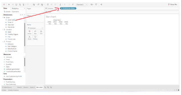

In the Rows section, we add a measure called Sales.


A bar graph displaying total sales for each year is created.
By dragging and dropping a Region field into the Color card present in the Marks section, we can add another detail to the bar chart.


Each bar (representing a year) is divided into four colored sections representing sales in four regions, Central, East, South, and West.
Hovering the cursor over any colored section on a bar reveals the sales details for that section.


- Segmented Bar Chart
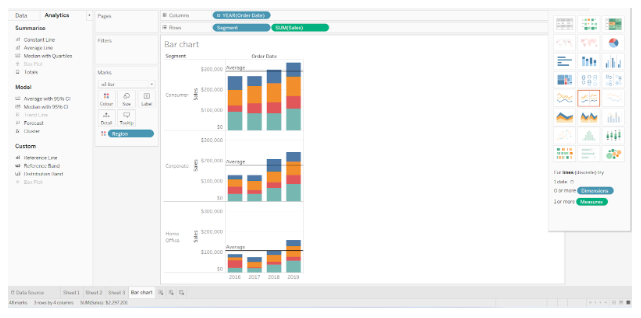
Tableau also allows us to create segmented bar charts. We simply need to add one more dimension to the Rows section in order to accomplish this. In the Rows section, we have added the Segment field along with the SUM(Sales) measure.
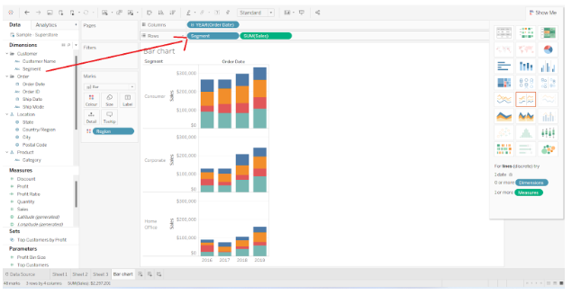

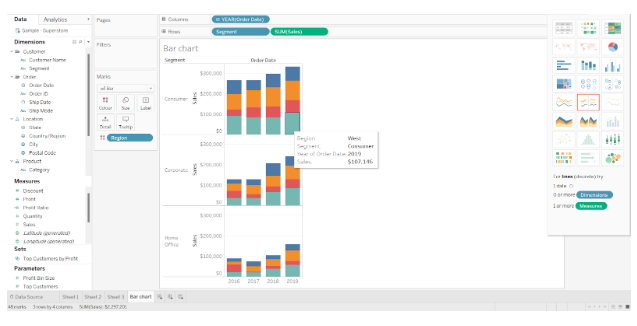
The bar chart is divided into three segments; Consumer, Corporate, and Home Office. In one space, there are three different bar graphs for each segment.

Other formatting options, such as adding reference lines, are available in Tableau. The average line can be added to the Analytics pane by clicking on it.


Selecting this option allows us to select a reference line type from three options. In this case, we select Pane style.
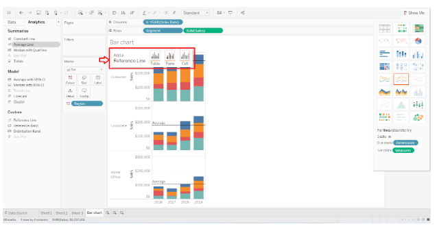

For each segment, this adds a reference line showing the average sales.

Additionally, we can format the bar graph and the fields in it by right-clicking a field and choosing Format option from the list.
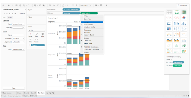

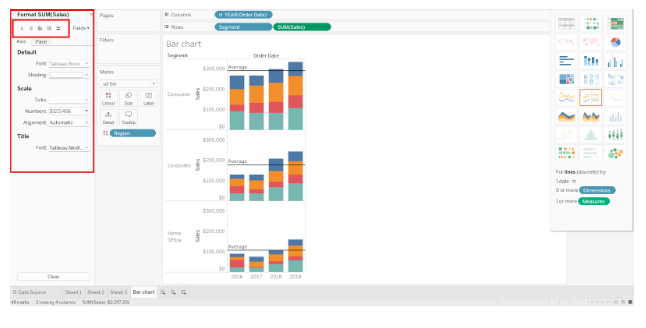
On the left, you’ll see the Format Pane where you can customize the axis, values, background, fonts, and panes according to your needs.

- Stacked Bar Chart

The stacked bar chart can also be created by dividing a single bar into multiple sections and stacking them on top of each other. Each stacked section is sized according to the value it represents. It is also important to note that each section of a stack is assigned a unique color.
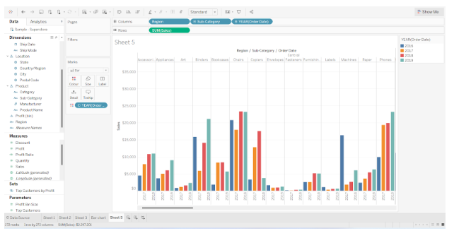
- Side-by-Side Bar Chart
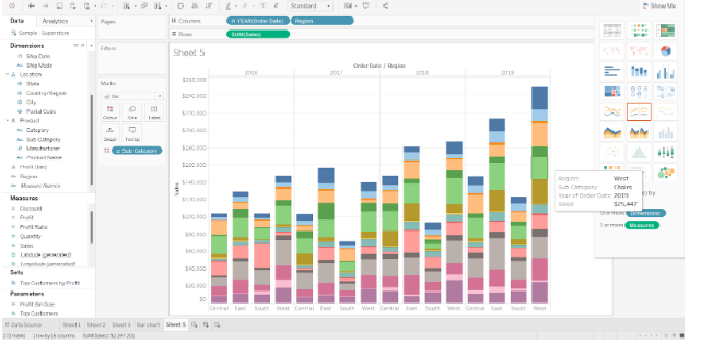
By creating a side-by-side bar chart, you can display multiple values corresponding to a single dimension. A side-by-side chart displays all values corresponding to a dimension side-by-side, rather than stacked upon one another.
In the screenshot below, you can see separate bars showing total sales for each brand for each year. In other words, we have a set of bars for 2016, another for 2017, another for 2018 and another for 2019. The information and insight provided by such bar charts can be analyzed in great detail.

Conclusion
In this tutorial, We learned how to create a simple vertical bar chart, segmented bar chart, stacked bar chart, and adjacent or side by side bar chart.