Dual Axis – Tableau
A dual-axis chart is a type of chart that displays two sets of data on the same chart with two different scales on the y-axis. This allows for the comparison of two sets of data that may have different units or scales, but still have a relationship or correlation between them.
Dual-axis charts can be helpful in providing a more comprehensive view of data and allowing for easier comparison between two sets of data. However, it is important to use them appropriately and to ensure that the scales are clearly labeled and easily understood by the audience.
How to create a Dual Axis Chart
The dual axis charts help in presenting plenty of information in the limited space present on your dashboard and also allows you to understand the trends, you may have missed otherwise.
Taking our US Super Store dataset, we have two measures: Profit and Sales. These two measures have different magnitudes and scales. Let’s dive straight into implementation.
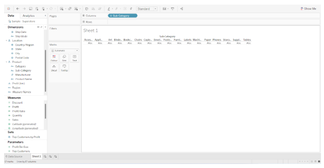
In this visualization, we are going to use three subcategories of the dimensions as well as two measures, Profit and Sales.
First we should create a new worksheet and add the Subcategory from the Dimension Pane to the Columns shelf.
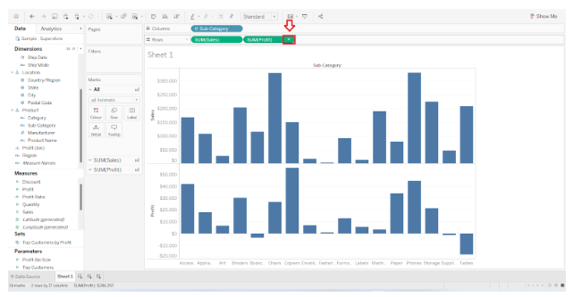
Using the Measures pane, select Sales and drop it in the Row shelf below the Sub-Category. In the same way, select Profit and drop it next to Sales on the Row shelf. After this step, your visualization will look as shown in the image below.

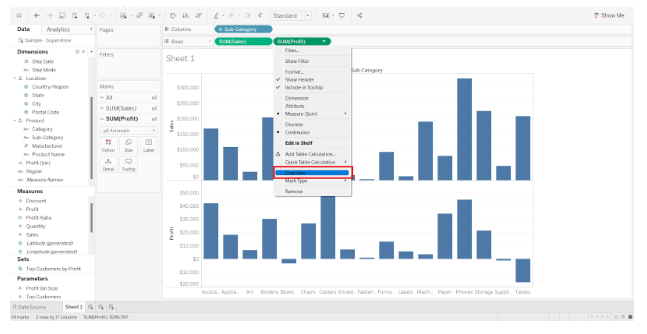
This is a two axes chart with two different axes represented on it. The next step is to convert these two different charts into a dual axis chart by clicking on the triangle present on the profit pill in the rows shelf.
From the following drop-down menu, select Dual axis.
The visualization changes completely once you select the Dual axis button.
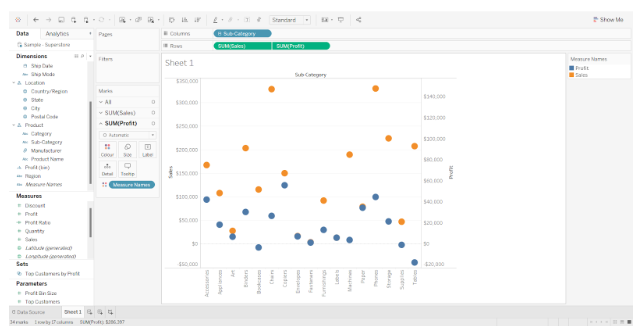
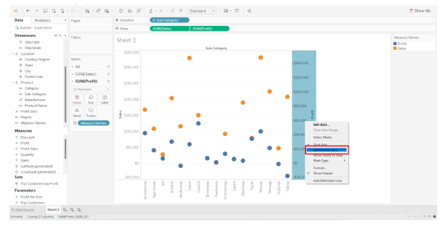
There is a dual axis visualization, but they are on different scales. To bring both measures to the same scale, right-click on any axis Profit or Sales and select synchronize axis from the menu. As shown in the image below.
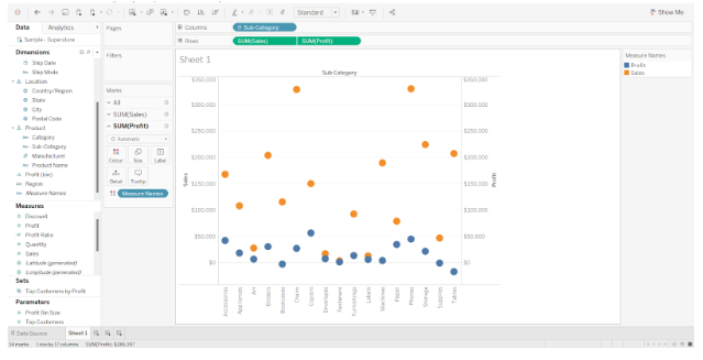
The result is a dual axis chart with synchronized axes.
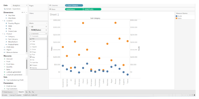
To In order to make it more interesting, you can further play around with it, such as changing the shape of Sales from Automatic to Bar in the market card, or changing the hues and borders.
As an alternative, you can go to Profit and change its shape to a line. Your final visualization will look as follows.

This is how we can create dual axis chart. Tableau is an exciting tool that enables users to apply their creativity and create magnificent visualizations.