
Tableau – Filtering
In this tutorial, we will learn how to apply filters to Tableau data. Using Tableau, we can apply simple filters to data visualizations and also apply some advanced types, like extract filters and interactive filters.
Types of Filters in Tableau
Now let’s discuss the different types of filters that tableau provides for us and which we can use for our dataset. Here are five types of Tableau filters:
- Extract Filters
- Data Source Filters
- Context Filters
- Dimension Filters
- Measure Filters
Tableau’s Extract filters extract a small subset of data from the original source. Tableau gives us two options when connecting to a data source; Live or Extract. Data extracted from a data source is stored locally in Tableau’s repository after it is extracted. The value present in the extract can therefore be used as a filter.
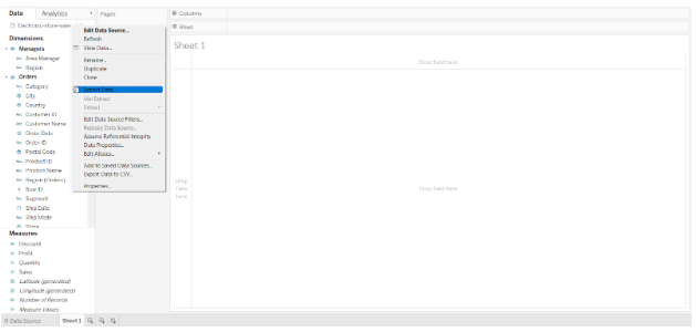
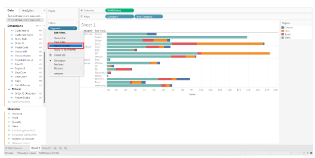
Select Extract data from your data source by right-clicking.

Choose the field and select the field values to apply a filter to. An extract was made with sales data for only the West region and the Corporate segment.
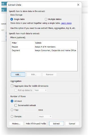

Once we click on Extract, the graph for the West region and the Corporate segment will be updated. By doing so, we can create multiple extracts and apply them as filters to the Tableau sheet.

Data Source Filters
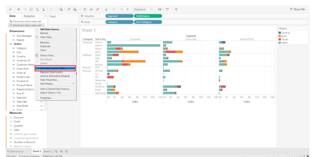
Using the data source filters in tableau, we can directly apply our filter conditions to the data source. Initially, the data is filtered at the source and then only the remaining data is uploaded to the Tableau worksheet. Go to the Data Source tab and click on the Add option present in the upper right corner to apply a data source filter.


On the dialog box that appears, click Add again. After selecting your field, tick the values you want to keep and click OK. You will see a summary of the selected data source filters. To apply the filter, click OK again.


Now, we have data for sales of only two categories. From here, all the data we create will be related to this filter.

Context Filters
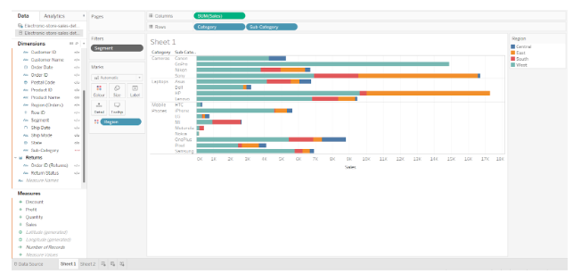
Tableau’s context filters allow us to apply a general context to our overall analysis. For example, in our sales data, we apply the corporate segment context. Therefore, all analysis after this will be relevant to or in the context of corporates.
To add a filter as a context in your Tableau sheet, right-click the field value in the filter pane and select Add to context. From the same drop-down box, you can remove the context.

When a context is applied, the field name on the filter pane will turn gray.

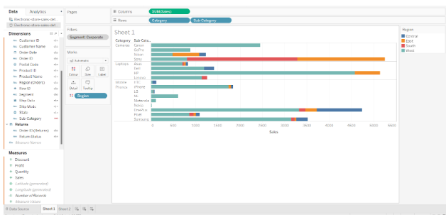
As can be seen in the image below, Tableau will display sales information only for the Corporate segment when the context is applied to the graph.

Dimension Filters
Dimension filters are the filters we apply to individual dimensions. As dimensions are not aggregated, we can select distinct values from the list of field values. Drag a dimension from the list of dimensions to the filter pane to apply the dimension filter. Complete the filtering process and apply the filter. The filter pane displays the dimension filters in blue.

Measure Filters
A measure filter refers to the filters that we apply based on the values in the measure field. Measure values are always aggregated, such as sums, averages, medians, etc. You can apply a measure filter by dragging a measure field from the measures list to the filter pane. You will be asked to choose an aggregation type based on the filter value.
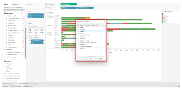

As a next step, it will ask you to select a range of values for the selected field. Set your range by moving the slider.
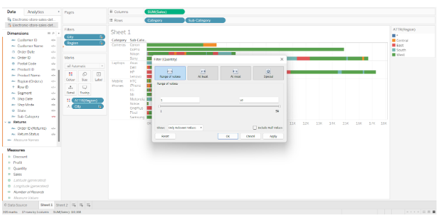

As can be seen in the screenshot below, the graph of sales only shows the total number of items sold between 50 and 250.
How to Apply Filters in Tableau?
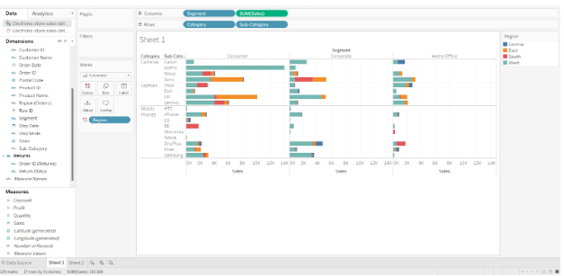
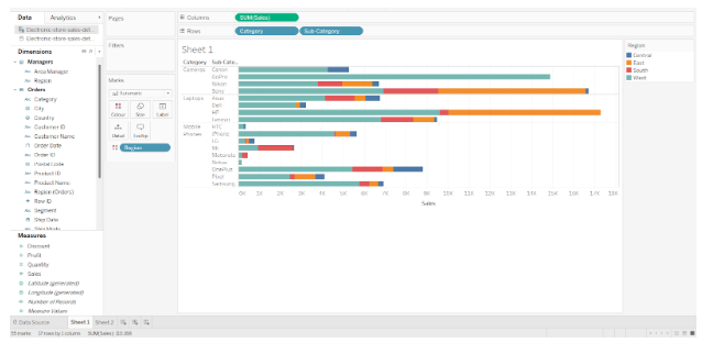
For a better understanding, we have provided a sample data set for an electronic store in the USA. We connected Tableau to the data source in our system. Take a look at a horizontal bar graph in tableau that shows sales of electronic items such as phones and cameras by category and subcategory.
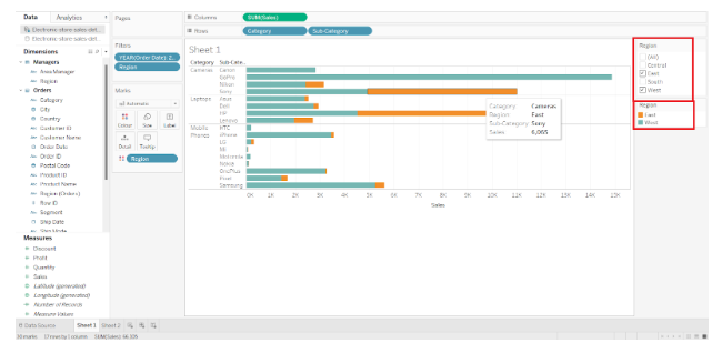
Each bar displays colored segments that represent region-wise segmentation based on sales. It shows the total sales for each region of the United States, such as Central, West, South, and East. The graph also contains the fields “Sales”, “Category”, “Regions”, and “Subcategory” from the data set.

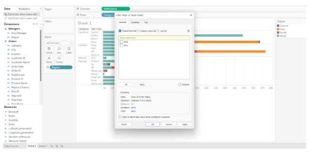
The data set contains sales data for four years, namely 2016, 2017, 2018 and 2019. Our next step will be to apply filters to this dataset so that we can see only data from 2018 and 2019.
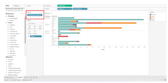
Step 1. First, we drag the field or dimension “Order Date” to the Filters pane. Considering our field is a date field, it will ask us how we wish the date to appear, e.g., year, quarter, month, days, weekdays, etc. By selecting Years, we proceed to the next step.


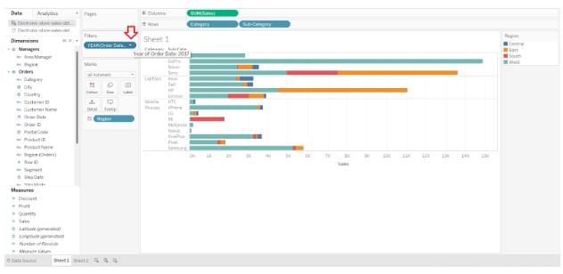
Step 2. Next, we are asked to select the years from the list of years available. The years 2018 and 2019 are selected. Select your choices from the list by checking the square boxes and clicking OK.

Step 3. Upon applying the Tableau filter, the graph will automatically update and show two separate sections for 2018 and 2019. On the left hand side of the filter card, the name of the field is displayed along with the filter we have selected, which is YEAR(Order Date).

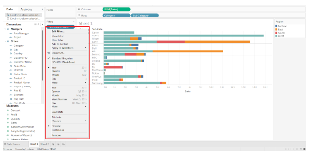
Step 4. From this filter card, we can explore a wide range of filter-related options. To access more options, click on the downward arrow next to the field name.

The following options are available to us to manage our filter choices: Edit filter, Show filter, Clear filter, etc. From this drop-down list, we can also select values and make quick changes.

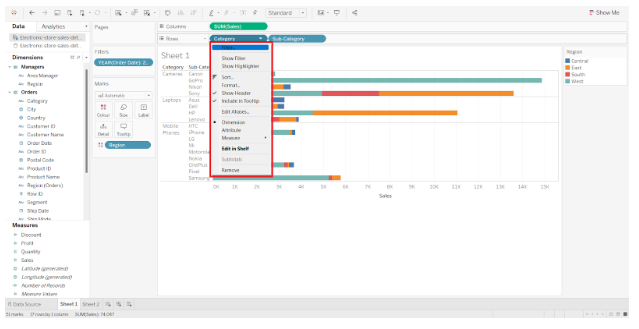
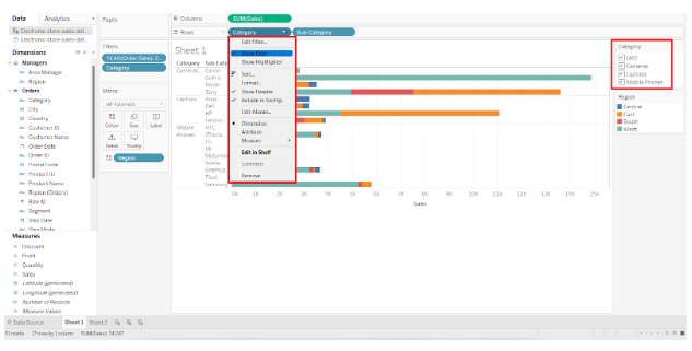
Step 5. We can also apply filters to individual fields when making graphs. In the Row and Column sections, all we need to do is open the drop-down menu by clicking on the small downward arrow located on the right of each field. In the drop-down list, there is an option for Filter, which allows us to apply the filter to specific field values.

Step 6. Additionally, the Show Filter option will display the filter pane on the right-hand side of our spreadsheet. To apply/remove filters, we can easily select and deselect values from here.

Filter Pane
In the previous section, we learned how to filter our dataset in Tableau by removing unwanted data. Let us now examine Tableau’s filter pane in greater detail. You should be familiar with all the options and tabs of the filter pane so that you can remain efficient.
The filter pane in Tableau has four tabs:
- General Tab
- Wildcard Tab
- Condition Tab
- Top Tab
There are a number of useful options available on each of these tabs. Let us take a closer look at these four filter pane tabs.
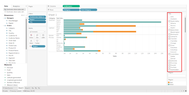
- General Tab
For our analysis, we can select which values we want to keep or remove from a column in the general tab. Basically, the data we want to filter. In the image below, we select two regions of our choice from the list. To apply the filter, click OK.
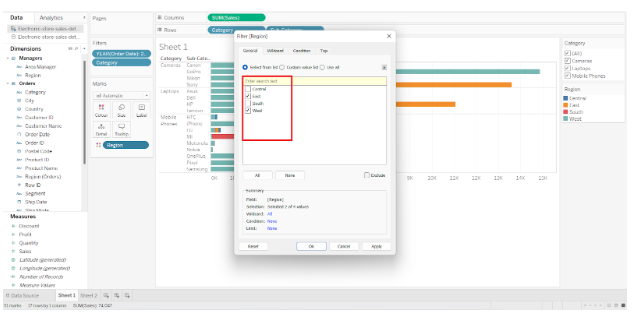

Next, we have the Custom value list, where we can type the field name and add it to the filter list.

There is also an option called Use all, which we can use if our list is very long and we don’t wish to manually select all the values.
In addition, it provides an Exclude option, which excludes the fields selected by us and displays the remaining or unselected fields.


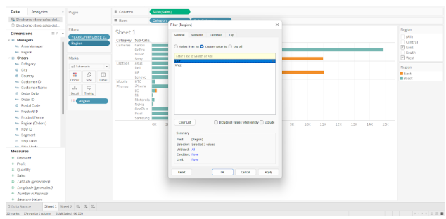
As an example, we selected the Central and West regions earlier. Only the South and East regions are displayed when we select the Exclude option.

- Wildcard Tab
On the Wildcard tab, we can specify the string literals based on which our data can be filtered. There are a number of options available, including Contains, Starts with, Ends with, and Exactly matches.
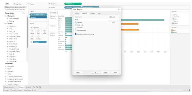

From the enormous list of cities, let’s only see the sales data for the cities starting with New, such as New York, Newark, etc. The Wildcard tab will provide us with all the matching results if we type New.

Wildcard filters are case-sensitive.
Our sheet can also have a wildcard search bar on the right. The value we wish to search for can be entered and the enter key pressed.


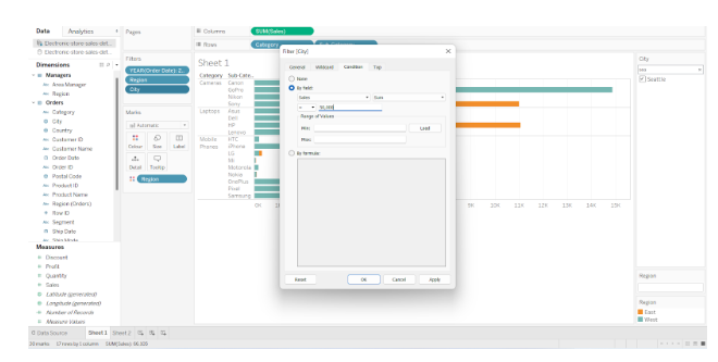
- Condition Tab
The condition tab allows us to apply a condition to the filter. In the case of a graph showing region-wise sales of electronic items, we can apply a condition filter in order to display only sales values greater than $50,000.
Once we click OK, it will display regions where total sales exceeded 50,000. It is also possible to create your own formula with the condition of your choice and apply it here.
In order to accomplish this, select the By formula option and enter a formula that serves as a filter condition. The filter formula option allows you to enter a condition based on your requirements and relevance to the data.
If you wish to show sales value greater than 50,000, we can enter a formula SUM([Sales])>50,000. Likewise, you can formulate any condition based on your needs in this section and apply it to your data.

- Top Tab
When using the top tab, you will be able to view only the top or bottom few values of a visualization. It is possible to set the criterion in the By field option of the Top tab.
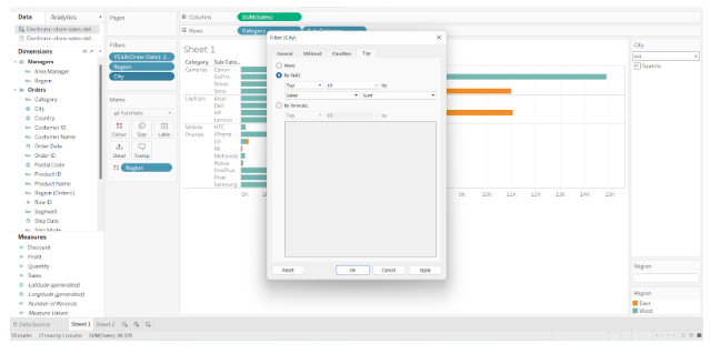

In the case of average sales, we would like to see the top 10 entries. As soon as we enter the conditions in the Top tab, we will receive a list of the top ten brands with the highest average sales.
This concludes the tutorial on Tableau filters.