Tableau – Forecasting
How does forecasting work in Tableau?
Forecasting is the process of predicting future trends by identifying regular patterns in measure values. Exponential smoothing is a technique used to identify regular patterns in existing data values and provide a forecast.
Exponential smoothing can be modeled in several ways. A total of seven to eight best models are selected by Tableau, and the best model with the highest quality is selected as the final forecast model.
The process of forecasting is based on two concepts: Trends and Seasonality. A trend can be defined as an increase or decrease in data over time, while seasonality is a variation in values over a defined period of time (such as weekly, quarterly, yearly, etc.). Forecasts can be made based on these predictable seasonal trends.
For predicting a forecast, Tableau usually considers variations occurring in a 12-month cycle since the time values are in a yearly cycle. If the data values are given on a 6-month basis, a 12-month trend is determined with two subtrends underpinning it. Depending on the data set, Tableau calculates seasonality and trends using different methods and models.
For a forecasting model, Tableau provides a number of options. We can either keep it on Automatic and let Tableau select the most appropriate forecasting model for our data and requirements. The Custom option allows us to choose from three types of trends and season characteristics, which are None, Additive, and Multiplicative. Detailed instructions will be provided in the following section on how and where to make these selections.
How to Create a Forecast in Tableau?
You can create a forecasting graph in your Tableau chart by following the steps below. In order to create a forecast graph, you must include at least one date dimension and one measure.
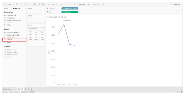
Step 1: In order to create a forecast, you must first develop a line chart from which your forecast will be derived. Data from this line chart will be used by the forecast models to calculate and provide accurate forecasts.
The first step is to add a date dimension in the Columns section and a measure field in the Rows section. As a result, we will have a simple line chart.

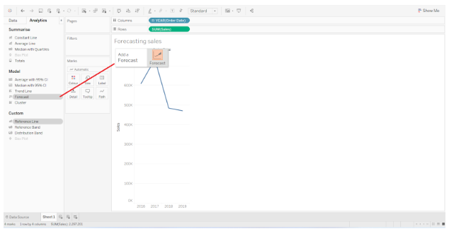
Step 2: In the Analytics pane, select Forecast from the list of available models.
Step 3: We can apply the Forecast model to our existing line chart by dragging the Forecast option to the graph area.
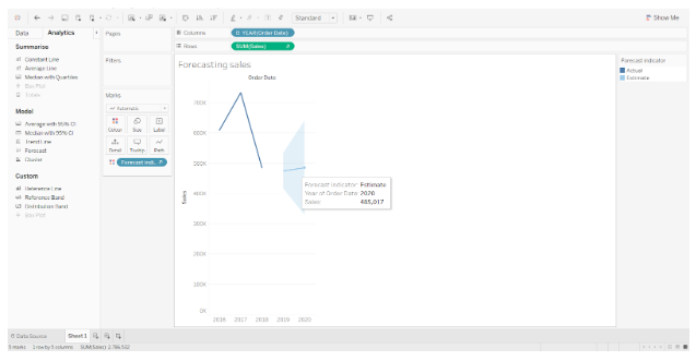
As an extension to your existing line chart, this will add a future forecast line. The data label also provides some basic information about the forecast.
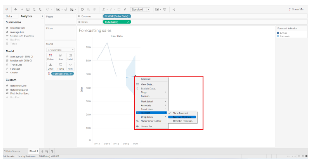
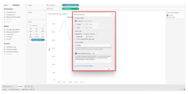
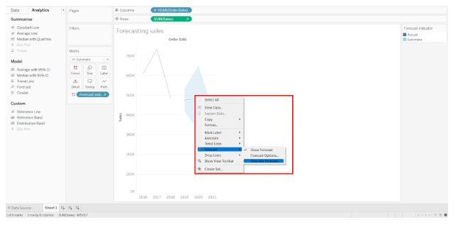
Step 4: If you would like to explore more forecasting options, right-click on the forecasting section and go to Forecast option and select Forecast options from the list that opens further.
In the dialog box that appears, you can select and set the forecast length, source data, aggregation type, and forecast model type. The forecast model is usually set to Automatic since it produces the best and most appropriate forecast graph. The Show prediction intervals option can also be selected or deselected and adjusted accordingly.
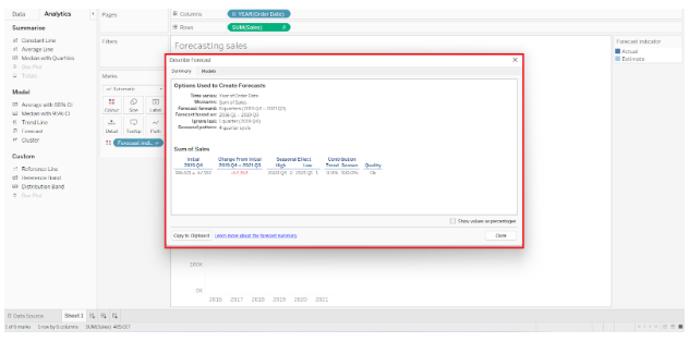
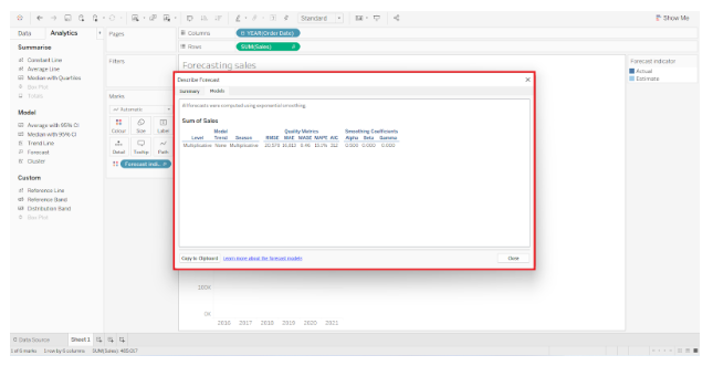
Step 5: The forecast can also be viewed in detail by right-clicking on the forecast section and choosing Forecast > Describe Forecast.
The Describe Forecast dialog will open with two tabs; Summary and Models. Below is a screenshot of the Summary tab, where you can find all the forecast information.
Models tab shows model type, trend, seasonality, etc.
Step 6: The same line chart can also display another measure. There will be a split view where you can compare the line charts and forecasts for two fields with respect to the same time interval. We have added a Profit measure to the Sales measure in the screenshot below. Drag and drop the measure field on the chart area to add a new measure.
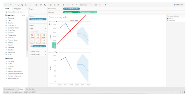
Step 7: It is also possible to change the color of the forecast region. Click on the Color card and select the Edit Colors option. By clicking on this button, a dialog box will appear from which you can select the color palette of your choice.
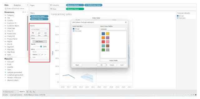
We have changed the color of our forecast indicator from blue to red, as shown in the screenshot below. Similarly, you may select the color scheme of your choice.

This is all about Tableau forecasting.