Tableau – Funnel Chart
What is a Funnel chart?
The funnel chart is an important visual representation of linear workflows in business intelligence. Stepped or smooth funnel charts can be used to visualize and understand the progression or workflow of a process. A funnel chart can also provide us with a systematic view of our data values.
How to Create a Tableau Funnel Chart?
To create a funnel chart in Tableau, follow the steps below. Ensure that you have uploaded a dataset to Tableau.
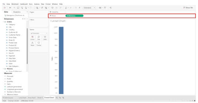
Step 1: Adding Measures to the Rows Section
The first step is to add one measure to the Rows section, which is Sales. The aggregation type is selected as SUM.
Step 2: Select Dimensions in the Marks Section
The next step is to select a dimension (Region) from the Dimensions list at the left and drag it onto the Colors card in the Marks section. Our vertical bar will be divided into four different colors, each representing a region.
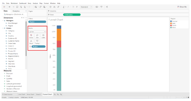
SUM(Sales) is then added to the Size box in the Marks section. In addition, we select the “Sort Region descending by Sales” option. The segments will be arranged on the bar in descending order.

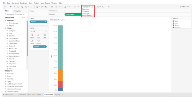
Step 3: Convert Standard View to Entire View
The default view type is Standard. We change it to Entire View so that our chart covers the entire view and looks more like a funnel.
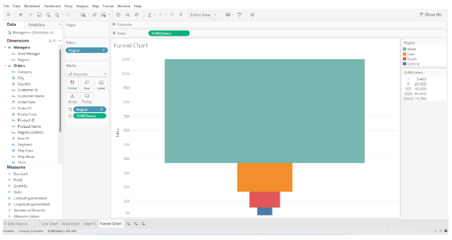
Step 4: Add Labels in the Marks Section
We then add the fields Region and SUM(Sales) to the Label box within the Marks section.
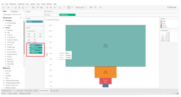
Step 5: Final Funnel Chart
In our funnel chart, this adds text labels indicating the region and total sales for each region block.
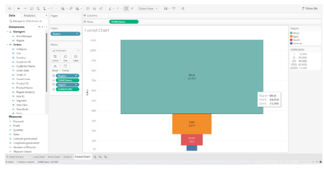
Here is our final funnel chart, which illustrates the total sales of electronic items in four different regions. Total sales are shown in descending order from top to bottom in the chart. As a result, this is a simple funnel chart or a stepped funnel chart.
This is how we can create a funnel chart in tableau.