Tableau – Gantt chart
What is a Gantt chart?
A Gantt chart shows the duration of an event for multiple values using horizontal bars. By using a Gantt chart, you can visualize your data values yearly, quarterly, monthly, weekly, or even daily.
In addition, we are able to assign different colors to each year or month, so that we are able to track the data trend for value over time more easily. Data can be represented in great detail using Gantt charts, making them extremely useful.
How to create a Gantt chart in Tableau?
Here are a few things you should keep in mind and select when creating your Tableau Gantt chart.
- Type of mark: Gantt bar or automatic
- Column shelf : you will find a date or time field (continuous measure).
- Shelves in rows: Dimensions
- Measurement of size: Continuous
Create a Gantt chart in your Tableau worksheet by following the steps below. This chart is based on our sample data set for electronic sales. With your dataset, you can create your own Tableau Gantt Chart by understanding the basics.
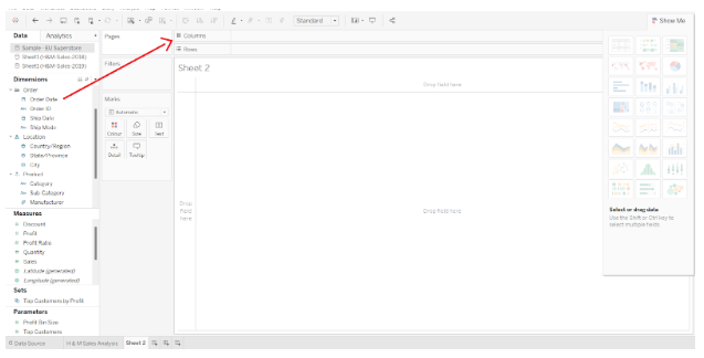
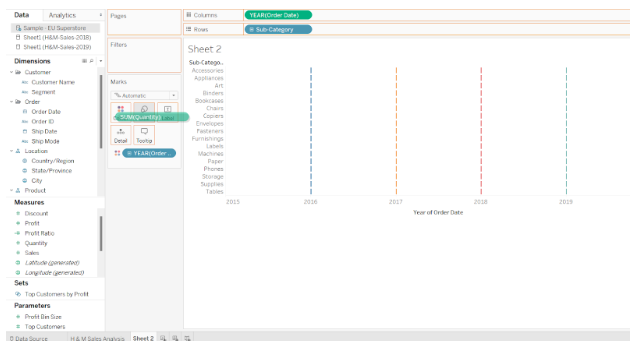
Step 1: Drag the Order Date Dimensions to the Columns section
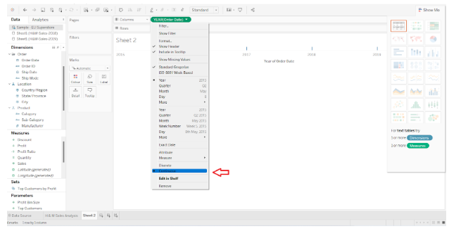
Open Tableau Desktop and create a new worksheet. In the Data pane on the left, you will find a list of Dimensions and Measures. As shown in the screenshot below, we drag the Order Date dimension to the Columns section.
By default, our date dimensions are set to Discrete. From the drop-down menu, we will select Continuous.
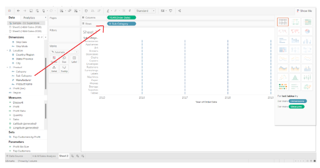
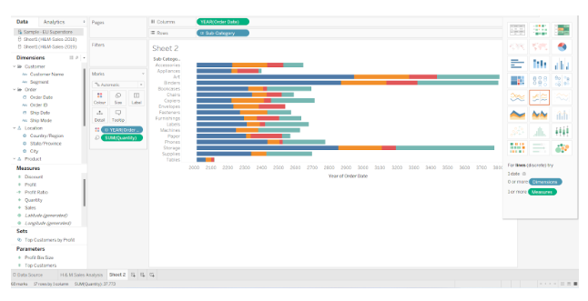
Step 2:In the Rows section, drag another dimension
By dragging and dropping another dimension (Subcategory), we are able to add another dimension (Subcategory).
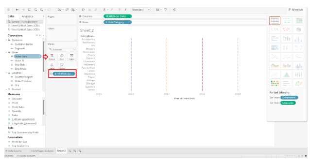
Step 3:Add the order date to the marks card
The Order Date dimension is again added to the Color box in the Marks card. Each data point will be represented by a single dash.
Step 4: In the Marks Card, add measurements
The next step is to add our measure quantity to the Size box in the Marks card. There are bars for the total quantity sold in each category during the respective year.
Step 5: Simple Tableau Gantt Chart
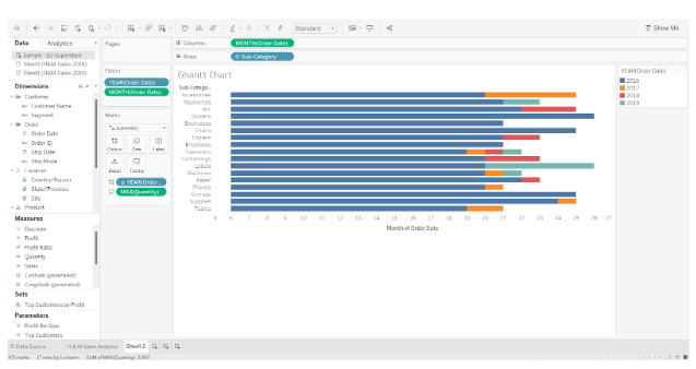
This gives us a simple Tableau Gantt chart showing the total quantity sold for each brand or sub-category over the last five to six years. In the screenshot below, you can see a separate bar with distinct colors for each year so that you can see the value of the total quantity for each brand in each year.
Step 6: Add Detail in Tableau Gantt Chart
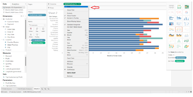
Our Gantt chart can be as detailed as we like. We change the years to months, for example. In the chart, you can see distinct bars for each month’s total quantities sold.
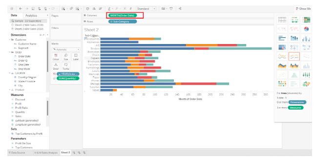
From the Marks card, we can also change our measure calculation. Click on the measure (Quantity) name, select Measure (), and change the aggregation type to Maximum.
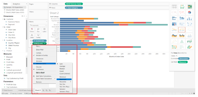
The maximum quantities sold for each brand in each year will be shown here.
Step 7: Set Filters on Date Measures
Furthermore, we can filter the date measures as well. Select Edit Filter from the right-click menu of the date dimension.
Step 8: Check Data in Gantt Chart
From the filter dialog, you can select a range of dates for which you want to see data in the Gantt chart. Click on OK.

As the dates in the range belong to the years 2018 and 2019, there are only two colors in the bars.
As a result, this Gantt chart only shows data for 2018 and 2019.