Tableau – Heat Map Chart
What is Heat Map?
The density heat map is used to analyze areas in a plot where data points are dense or scattered. Heat maps are used specifically when there is a large data set with overlapping values. By doing so, analysts may be able to identify areas with a greater density and discover trends in the data. We will learn how to create a density heat map in Tableau in the following section.
How to Create Tableau Heat Map?
Here is a guide to creating a heatmap in Tableau.Using our sample dataset pertaining to sales at an electronics store, we will create a density heat map.Please ensure that you adhere to the following points and requirements before we begin creating our heatmap.
- Columns: At least one continuous measure
- Rows: At least one measure or dimension
- Mark type: Density
- Marks card: At least one dimension
Step 1: Add Measure Profit
As a first step, we add a measure Profit to the Columns section.
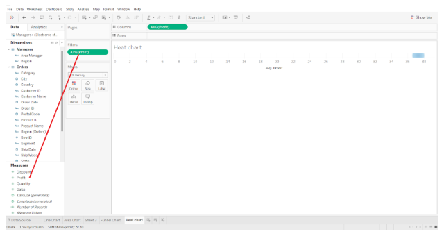
The aggregation type is set to AVG, which represents the average of the values in the fields. In addition, we ensure that our measure is of the continuous type.

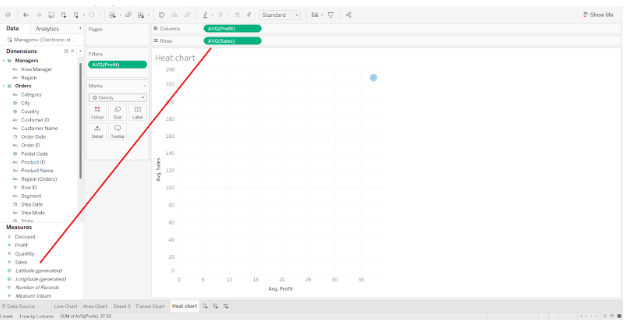
Step 2: Add Measure to Rows Section
In the Rows section, we add another measure field, Sales, and select the Average of the field values again. Aggregation types can be set according to your analytical requirements.
A plot with two axes appears on the canvas as shown in the image below.
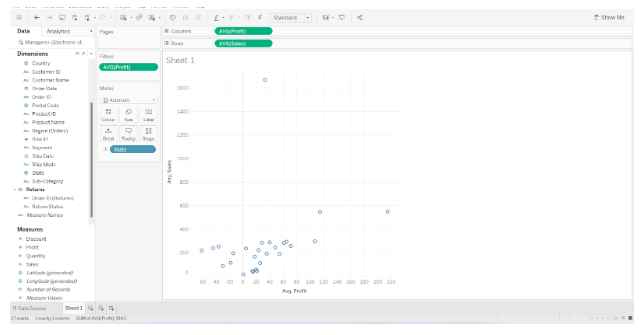
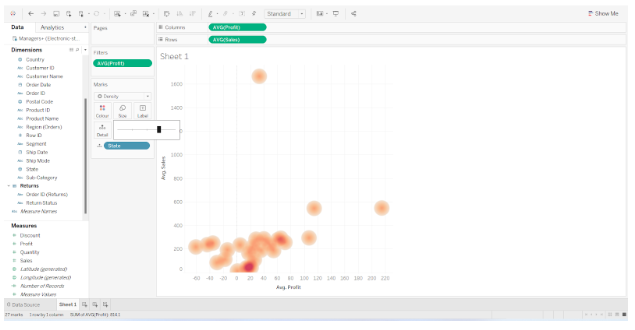
Step 3: Add Dimension Field
Next, we added a dimension field, State, to the Detail card present in the Marks section. A group circle representing different states will be added to the plot, showing average sales and average profits for each state.
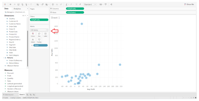
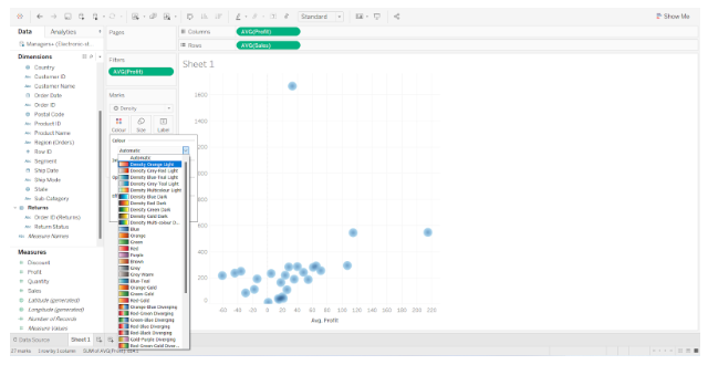
Step 4: Select Density Mark
Using the Shape as Density option, we will convert this plot into a density heat map. The shape of the data points will be changed from circles to density spots as a result. The color scheme of data points will be based on a gradient of density.
Data points in dense areas will appear in red or orange, while data points in sparse areas will appear in greenish-blue. Color schemes can be selected for heat maps according to your preference.
Step 5: Set Intensity and Opacity
To select a color scheme, right-click on the Color card and explore the options. The intensity and opacity of the heat map can also be adjusted from here.
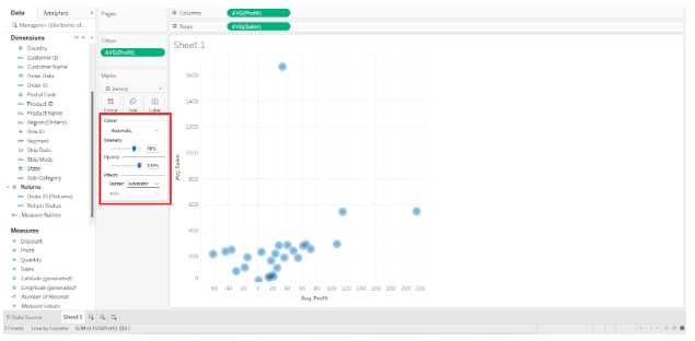
The color scheme can be selected from a wide variety of options.
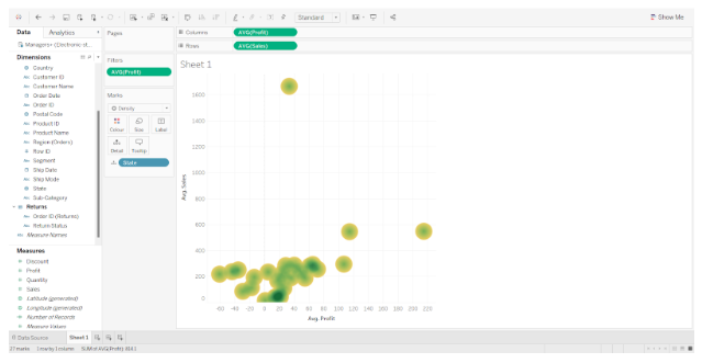
Step 6: Set Size of Tableau Heat Map
Density spots can also be increased or decreased in size.
Step 7: Create Final Tableau Heat Map
Tableau creates a heat map or density heat map in this manner. If you hover your cursor over the density points on the map, you will be able to see more information about the data points. On the text label, we can see all the relevant details.
This is how we can create heat chart and make additional changes as required.