
Tableau – Histogram
What is Histogram?
The histogram represents the distribution of values along an axis on a graph. An analysis of a histogram provides statistical information about the probability distribution of values occurring in successive intervals of equal size. By using histograms, we can perform an insightful and informative analysis.
How to Create a Histogram in Tableau?
To create a histogram in Tableau, follow these steps:
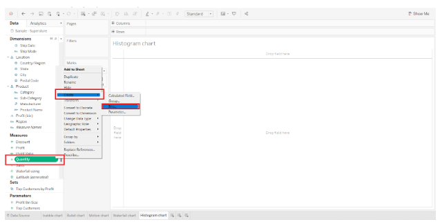
Step 1: Create Bins in Tableau
Creating bins is the first step in creating a histogram. Bins are types of measures that define fixed value ranges as bins. The values in a field are then grouped into a certain bin. As a result, the distribution of data values becomes continuous.
Right-click on a measure (we selected Quantity) to create a bin. Select Bins from the Create menu

Next, we enter the name of the bin or new field and set its size in the Edit bin dialog. The size of the bin determines the intervals on the axis and is determined by the values in the field. To get a suggestion from the system, click on Suggest Bin Size if you cannot decide the bin size.
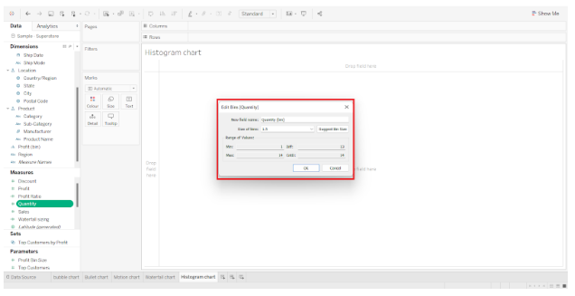

In this case, we have set the bin size to 1.5. This means that all values in the Quantity field that fall between 0 and 1.5 will be included in the first interval. Similarly, the values falling between 1.5 and 3.0 will be included in the second interval, and so on. This provides a continuous distribution of values in the chart, making it easier to plot and analyze.
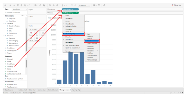
Step 2: Add Quantity into Rows and Columns Section
Now we add our newly created measure Quantity(Bin) to the Columns section and Quantity to the Rows section. Select Count as the aggregation type for the selected measure.

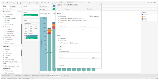
Step 3: Adding Dimension Field to the Color Section
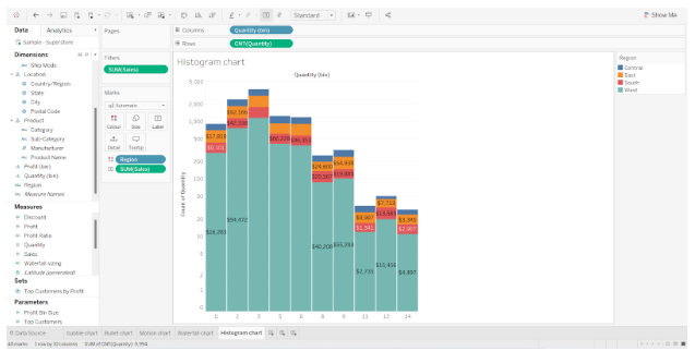
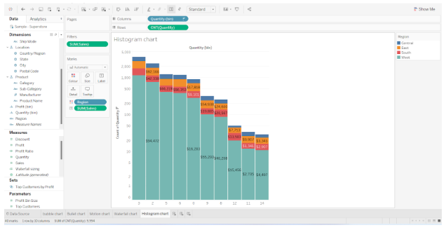
The next step is to add a dimension field Region to the Color section and measure SUM(Sales) in the Label section. Each bar of the histogram has four regions and text labels showing total sales for each region.


Step 4: Select the Logarithmic checkbox and Symmetric radio button
Our bars in tableau still have gaps between them, so it’s not a true histogram that shows continuous distributions of values on an axis. In the Scale section, right-click on the y-axis and select the Logarithmic checkbox and Symmetric radio button.

Step 5: Finalize Tableau Histogram
As a result, we have our histogram ready. On the x-axis are bins of size 1.5 containing values from the Quantity field and on the y-axis is a count of values from the Quantity field. They also show total sales done in different regions for the quantities sold, with heights corresponding to quantities sold.

Similarly, we can create a histogram for Sales values.

This is how to create a histogram in Tableau Desktop.