
Line Chart – Tableau
Tableau offers a variety of tools that can be used to create a wide variety of line charts. To begin with, let’s know about line charts in tableau.
What are Line Charts?
A line chart represents multiple data points by connecting them with a single line. The data points on a plot are known as markers. Line charts are used to analyze trends revealed by datasets. For the same reason, line charts are important in forecasting and trend analysis.
How to Create Line Charts in Tableau?
To create a tableau line chart, follow the steps below. Tableau Desktop is being used to analyze a sample data set of Electronic Store sales. If you wish, you can create a line chart using your own data set.
Step 1: Adding Dimension Field and Measure Field
We will begin by adding a dimension field in the Columns section and a measure field in the Rows section. From our dataset, we add the Order Date (dimension) and Sales (measures) fields.
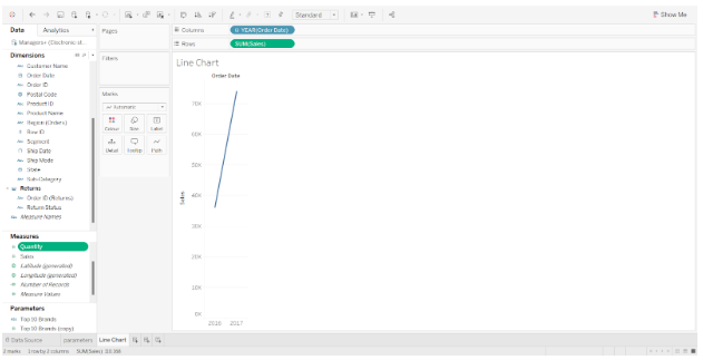

In the editing area, a preliminary line chart is created. Using two-measure variables, we will now perform several additional steps to create a dual line chart.
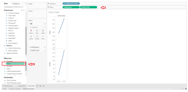
Step 2: Add the Profit Measure field to the rows
This is accomplished by adding another measure field to the Rows section; Profits. This instantly creates another line chart showing profit values for all the years concerned just below the first one.

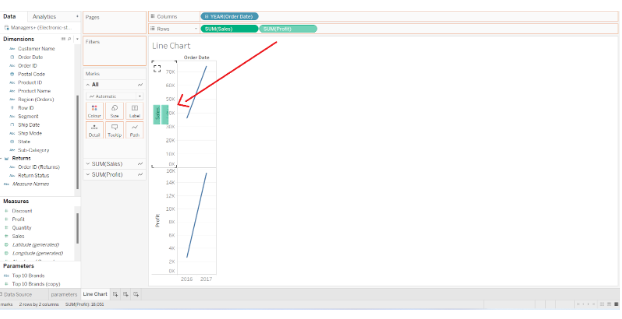
Step 3: Drag the SUM Measure Field to the Y-axis
Due to the fact that we have two different measure variables (Sales and Profit), we are able to treat them collectively as one measure. This is accomplished by dragging the field SUM(Profit) to the y-axis.

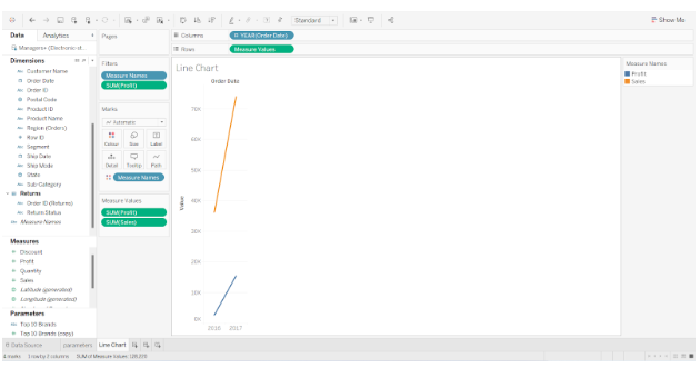
Step 4: Find the Details of Measure Fields
We will now have a common y-axis for both Sales and Profit values. In the Rows section, we do not have two separate measures, but rather one Measure Value containing both measure fields. Under the Marks card, we can find the details of the Measure Values card.
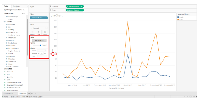
The field Measure Values can be placed in the Color card in order to make the two-line charts distinct from one another. In this example, the profit line is shown in blue and the sales line is shown in orange.

Step 5: Manage the Appearance of Tableau Line Chart
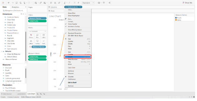
We now have two line charts that share a common y-axis and x-axis. The Order Date type can also be changed from Year to Quarter, Month, Day, Week, etc. The date has been changed to the month.
In the screenshot below, you can see data points for each month in the respective year. We can see the details of the month, year, and profit or sales value by placing our cursor over the data points.


Additionally, we can modify the color scheme, line opacity, chart borders, line markers, halo, etc., to enhance our line chart in tableau. If we wish to add labels to the tip of each data point in the line chart, we can drag and drop our measure field into the Label card located on the Marks card.

Forecasting lines may also be added as extensions of the existing lines, showing forecasted or probable values for future years.
This is how a line chart can be created in Tableau.