Tableau – Pie Chart
What is a Pie Chart?
Pie charts are circular charts divided into multiple sections, each representing a portion of the whole. For BI software such as Tableau, pie charts can be used to represent performance by category, region, or section. Pie charts can be used to analyze sales, profits, and other statistical parameters. The pie chart in Tableau can also be filtered to display only a portion of the entire chart.
How to Make a Pie Chart in Tableau?
We will create a Tableau Pie Chart step-by-step in this section.
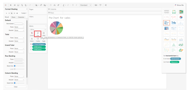
Step 1: How to convert a simple bar chart into a pie chart
In Tableau, open a worksheet and drag a dimension field and a measure field into the Columns and Rows sections. At first, a simple bar chart appears. Select the Pie charts option from the visualization pane to convert that into a pie chart. The visualization pane can be accessed by clicking on Show Me.

Step 2: Increase Size of the Tableau Pie Chart
On the editing pane, you can see a small pie chart. By holding Shift+Ctrl and B, you can increase the pie chart’s size. Click on B several times to keep increasing the size until it reaches the size you want. Alternatively, you can perform this operation via the Size option under Marks.
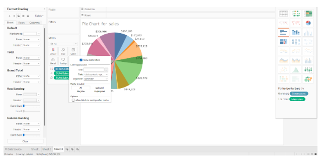
Step 3: Dimensions of a label card can be dragged and dropped
The Marks section will now display all the selected fields. To add labels to the pie chart, you may drag and drop fields from the Dimensions or Measures section to the Label card. We have added a field named Sub-Category to the pie chart, as shown in the screenshot below. On each segment of the pie, the names of all the brands or subcategories are listed.
Pie charts can also be customized with details and colors.
Step 4: Access Formatting Options
We also have a lot of formatting options for pie charts in Tableau. Pie charts can be formatted in any way you like using the Format option. Right-click on the pie chart and select the Format option.
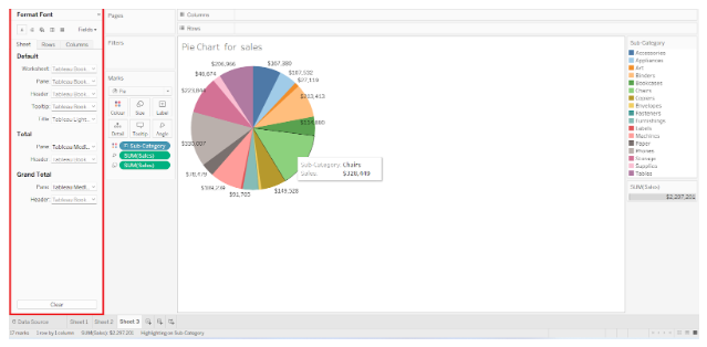
A Format pane will appear on the left with numerous options for formatting the pie chart, such as text editing, borders, backgrounds, shading, etc. The pie chart can be customized to your liking.

Step 5: Take a look at the pie chart showing total sales
The pie chart represents the total sales of each subcategory. Various colored sections of the pie can be hovered over to see details.

Step 6: Analyse Another Pie Chart
Below is another pie chart showing category and region-wise sales of the super store. While creating pie charts, we suggest using broad categories rather than densely segmented ones.
When you use the Category field instead of the Sub-category field, you can analyze your pie chart better since there will be fewer categories than subcategories. It simplifies the pie chart and divides it into appropriate segments for analysis.

Conclusion
Create pie charts in Tableau based on your dataset and requirements and use them in dashboards.