
Tableau – Stacked Bar Chart
What is Stacked Bar Chart?
Stacked bar charts consist of segmented bars. A stacked bar chart indicates distinct values of a field along one axis. These bars are also internally divided into different sections or segments that allow a greater understanding of the field values. As a result, we are able to compare the main values as a whole and gain insight into the distribution of smaller segments within a bar.
In a bar chart, for example, if one bar represents the total sales of electronic items in 2019, multiple segments within the bar can represent the number of total sales for each brand, such as Sony, Dell, Asus, etc. As a result, we can perform a detailed analysis and comparison of sales for 2019 as a whole and determine the contribution made by each brand.
There can only be one dimension field, which is a category axis, and up to two measure fields, which are numerical axes, in a stacked bar chart.
How to Create Tableau Stacked Bar Chart?
This section will walk you through the steps involved in creating a stacked bar chart in Tableau. The area chart in tableau allows you to easily observe the trends of your data, since we tend to focus on a larger area rather than comparing lines. In order to create a stacked bar chart using your dataset, open Tableau in your system and follow the steps listed below. We use the sales data from an electronic store as a sample set of data.
STEP 1: Create a Simple Vertical Bar Chart
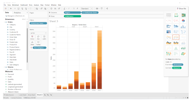
We will begin by selecting a dimension, Order Date, from the Dimensions section and placing it in the Columns section. As the field value for Order Date, we select YEAR.
Next, select Sales from the Measures section and place it in the Rows section. SUM is selected as the aggregation type.


Using the visualization pane on the right, we select the stacked bar chart option. Using this method, a vertical bar chart is created with the year as the x-axis and the sales as the y-axis.
STEP 2: Add Region Dimension into the Column Section
We will now add another dimension to our chart, which is the Region dimension in the Columns section. There are four sections or columns for four regions. There are now four bars in each column, each representing a different year.


STEP 3: Convert Simple Bar Chart into Stacked Bar Chart
As a next step, we create a stacked bar chart. The dimension Sub-Category is added to the Color card of the Marks section.


As a result, each bar is divided into small colored sections that correspond to different brands. We now have a stacked bar chart where each bar represents a year and whose height is proportional to the total sales made during that year.
Moreover, each bar is divided into colored sections that represent the total sales for each brand of electronic items in that year. In any colored section, if you place your cursor on it, it will show details such as Region, Sub-category, that is, the name of the brand, Year, and total sales value of that brand for that year.


STEP 4: Add Color Scheme into the Stacked Bar Chart
In the Marks section, we can also change the color scheme of our stacked bar chart. As we select the Edit Color option, we can browse through the many available color palettes and select the Assign Palette option to set our bar chart’s color scheme. To complete this step, click OK.
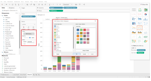

As a result, we have completed the process of creating a Tableau stacked bar chart in our desired color scheme.

Creating Tableau Stacked Bar Chart with Data Labels
By adding data labels to our bar chart, we can make it more informative. Drag and drop a relevant field from the Dimension or Measure section to the Label card in the Marks section on the left. Click on the Label card to format the font and style of the labels. This will allow us to display data values on the labels of each bar. Thus, this is all about stacked bar chart in Tableau.